You’ve defined your target persona, you’ve got your offer, and your perfect lead magnet is ready for the world. All you need now is a lead magnet landing page.
Sounds simple enough right?
Yes, creating a lead magnet landing page can be easy. But, if you want to create a high-converting page – that’s going to be more of a challenge. But don’t worry, we’ve got you!
A landing page can often be an overlooked aspect of the lead magnet funnel. But it’s the make or break for the potential customers. That is why it is so important to execute your dedicated landing pages perfectly.
In this post, we’ll discuss vital components of landing pages and show real-life examples of effective lead magnet landing pages. We will also talk about the importance of functionality, design and trust signals, as well as the role they play in boosting conversions.
9 Different Types & Examples Of Lead Magnet Landing Pages
Let’s explore several examples of real-life landing pages. We will discuss what makes the landing page effective, how it could perhaps be improved, and how it could be incorporated when developing your own lead magnets.
1. Free Ebook
These landing pages should include a brief description or extract of the Ebook’s contents. A general overview of the chapters or screenshots is also extremely useful and enticing to potential customers.
Example: Marketo
The landing page for Marketo’s ebook is to the point. There is a brief snippet of what you can expect from the book and a few key points.
Understandably, this lead magnet is so valuable, that very little would be required to convince visitors to part with their contact information.
However, there are too many fields that need to be filled in and a rather weak CTA button.
Example: Mixpanel
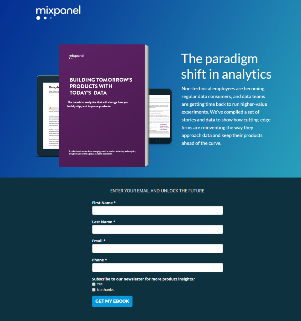
In contrast, Mixpanel’s landing page has shorter copy, bolder use of colour and a CTA button that is more actionable. If they really wanted to up the ante with this one, they could try incorporating a warm colour into the CTA and removing (or combining) one or two of the required fields.
2. Demo
These landing pages have information regarding exactly what you will have access to and for how long. Most businesses allow their potential customers full access to features but for a limited time. This allows prospects to get a full grasp of what is on offer.
Example: HubSpot
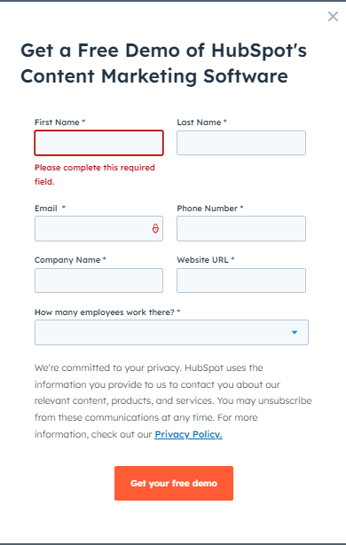
HubSpot’s free demo landing page wins points for having a disclaimer about the privacy of your contact information. Unfortunately, there are a few too many areas that require contact information. And while the colour scheme may seem bland, it keeps with HubSpot’s brand.
3. Free consultations
Free consultation landing pages are usually the ones that can bend the rules a bit. This is one case where long-form copy and several field forms are acceptable and effective. The required fields for a free consultation are numerous and a lot more comprehensive.
This is actually preferred. After all, it shows a genuine interest in specific details that will provide you with a worthwhile consultation.
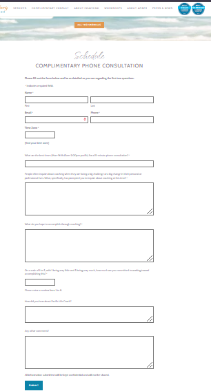
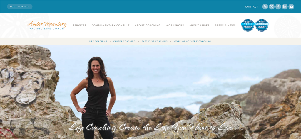
Example: Amber Rosenberg Pacific Life Coach
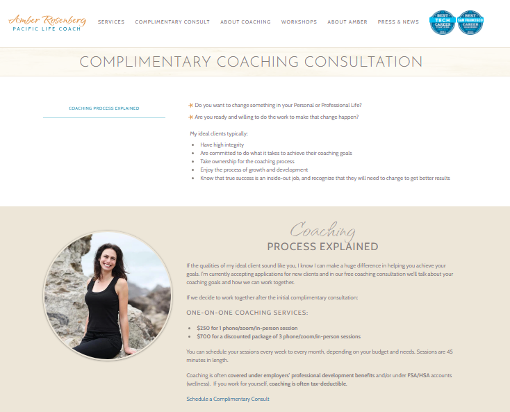
The Pacific Life Coach landing page covers all the necessary information about a complimentary consultation and has trust badges on display. The colours are muted which keeps with the aesthetic and vibe of the offer.
4. Free or discounted guides (limited-time offer) and workshops
These types of landing pages will also require a bit more information. The information should include the length of the workshop and what is covered on each day/section. While workshops and guides can usually be completed at the subscriber’s own pace, providing a projection of how long it should take is helpful.
The pages with a limited-time offer usually have a countdown timer or indication of how many offers are still available. The main goal is to elicit a sense of urgency in the potential customer. When a discounted price is on offer, the previous monetary value is always shown to further illustrate the discount rate.
Example: Athlean-X
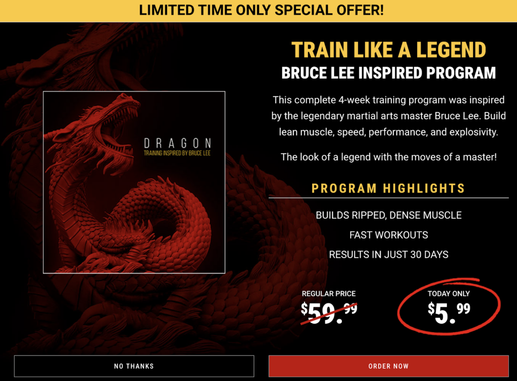
This example is an excellent execution of a landing page. The value of the offer is clear and the limited time urges the website visitor to take action. The copy on this page makes strategic use of words that excite and encourage potential customers such as “legendary”, “master” and “explosivity”.
Another key feature here is the promise of what you will be getting when you sign up for this program and how long it will take to get it. Specifics like this instil trust and also provide customers with ambition and a goal.
Example: Swat SEO
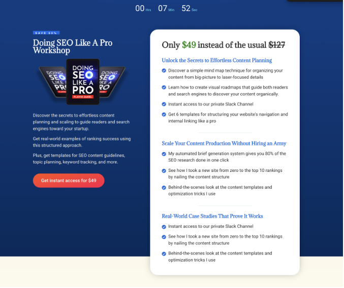
Swat SEO’s example of a discounted guidebook instils urgency and excitement. A countdown timer to the expiration of the offer, coupled with the impressive comparison of the discounted rate, will make customers act fast. Plus, there is further emphasis on the discount as seen in the eye-catching call to action button.
The overview of what you can expect in the guide is in bullet points, but the text could be a bit shorter.
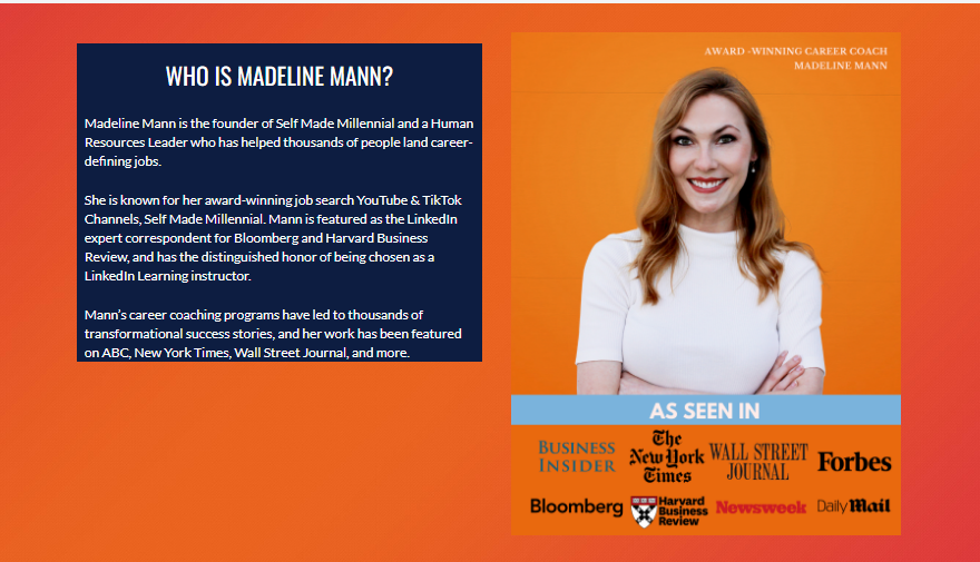
Example: Madeline Mann
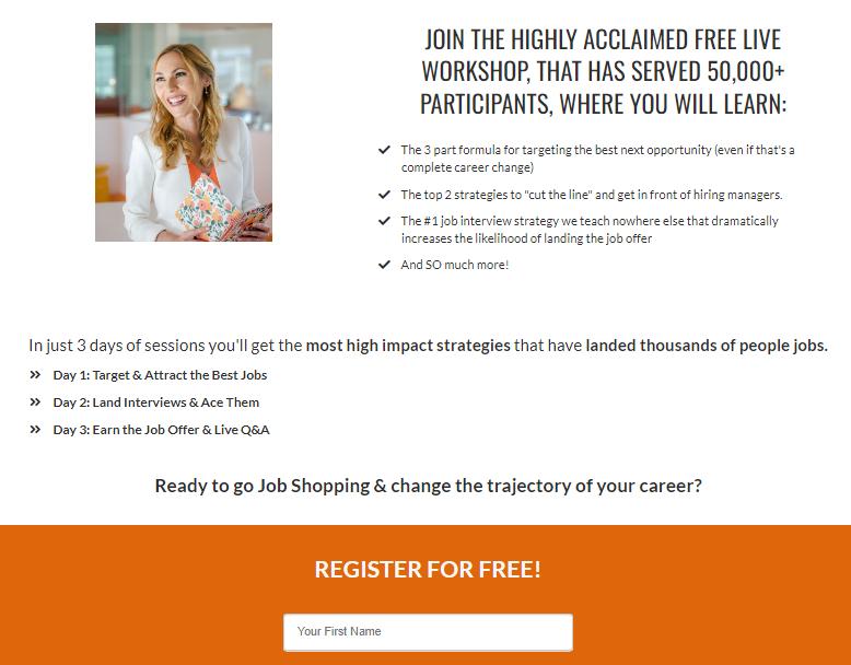
The image used for Madeline Mann’s workshop does a good job of personalising the content and putting a face to the company. The copy is clean and concise, with a tagline just above the highlighted CTA section, encouraging users to take further action.
Additionally, the use of check marks instead of bullet points is a clever psychological trick to illustrate that this is the correct option for the user.
5. Free templates
These landing pages should ideally include screenshots or images of the templates and specify which interface they are suited to. Bullet points of what you can expect are preferable over a long-form copy.
Example: HubSpot
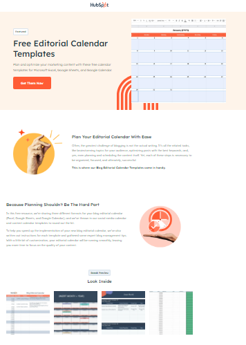
HubSpot’s landing page for editorial calendar templates does a good job by placing the call to action button high up on the page, just below a clear and enticing description. Further down the page, they use a graphic mockup to give customers a chance to page through the calendar, adding to the “buying” experience.
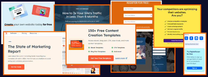
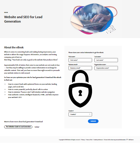
6. Free report
Report landing pages should provide a brief overview of the information contained within the document. Some pages have a sneak peek or excerpt from the report to entice customers. A screenshot of the layout is quite helpful to make the product more “tangible”.
Example: HubSpot
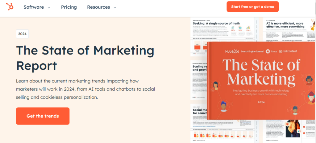
HubSpot’s State of Marketing Report landing page uses the concept of a graphic mockup to give the customer a sneak peek of what they will be getting. Plus, you can see the attractive and visually pleasing layout of the marketing report.
The CTA button is another good example of provoking your potential customers to take action without resorting to the overused “sign up now”.
7. Blog subscription
Blog subscriptions do not require too much information on their landing pages. An indication of how frequently blogs will be published, such as specific days of the week, is generally fine.
Example: Salesforce
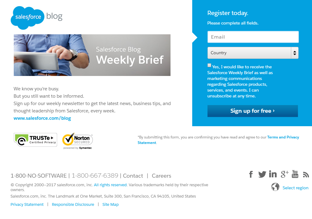
The Salesforce blog subscription landing page is short and to the point, with only two fields that need to be filled in. They have also given you the option to opt into marketing-related communications, which is another way of getting potential clients into your funnel.
The copy is clear and concise, but this lead magnet page could have benefitted from a contrasting colour and a more encouraging CTA button.
8. Free trial
These landing pages will specify how long the free trial is and what features you will have access to during this time. It’s quite common for the monetary value of the service or product to be a key feature on this page.
Example: DigitalOcean
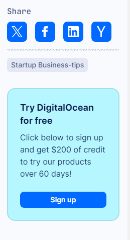
At a glance, this lead magnet landing page may seem bland and easy to miss. But the DigitalOcean did something very right by making their lead magnet shareable.
Additionally, they highlight the impressive $200 credit to use on their various products for a limited time. This is a good deal, and customers may know other people who would benefit from it.
DigitalOcean made sharing easy with the literal click of a button. As a result, the company will be able to reach new leads and gain exposure.
9. Webinar
Webinar pages require more information as the formats may vary. The landing page should clearly state whether or not the event is live or pre-recorded, the time and date of the webinar, and the specific time zone in which it takes place.
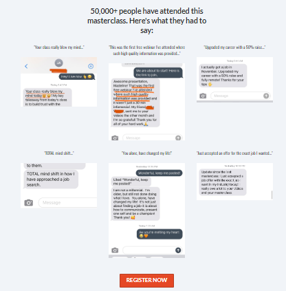
Example: Madeline Mann

This landing page for Madeline Mann’s three-day masterclass has all the relevant information required for a lead magnet of this calibre, such as:
- The dates of the webinar
- The start and end time
- The time zone
It also addresses the pain points of job seekers in today’s climate, which will resonate with potential customers. The one area for improvement would be having slightly shorter text.
Example: Leadpages
This is a damn near-perfect example of a webinar lead magnet landing page by Leadpages. It has a compelling headline, contrasting colours, an exciting CTA, and concise text. However, newer clients may have felt more at ease with a touch more information on the landing page.
What Does An Effective Lead Magnet Landing Page Look Like?
You have likely seen a slew of lead magnet landing pages as you’ve scrolled through websites. It is easy enough to create an attractive landing page, but it is crucial that it’s functional, effective, attractive and memorable.
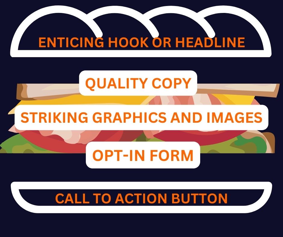
Think of your landing page as a sandwich. You need several layers to make it tasty and nutritious.
The ordering of the layers must be considered, as well as the number of layers. Too few layers and your sandwich is dry and unappealing. Too many layers and it is a big mess that will fall apart quickly. You need just the right amount of filling.
The components essential to each lead magnet landing page all serve a particular purpose and represent your brand. When implementing these components, you must ensure that they boost the overall functionality and design of the page.
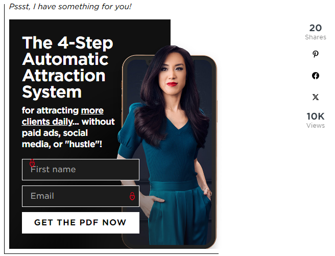
Captivating headline or hook
This is going to be the thing that grabs the attention of new leads. Don’t assume that just because users have come across your content, they are going to take the time to read all of it.
Quality copy
As a rule of thumb, always assume that your audience has the attention span of a goldfish. You need to get their attention immediately and keep it while providing vital information. No words should be wasted in the copy of your lead magnet landing page.
For landing pages such as templates, Ebooks, free trials and checklists, every single tagline and sentence should be short, to the point, valuable and entice visitors.
Using bullet points instead of long walls of text makes your content quicker and easier to digest. Your website visitors will appreciate this.
There is always the question of long-form vs short-form copy when it comes to a lead magnet page. Some lead magnet landing pages such as webinars and consultations require more information and long-form copy would be effective. As long as the information is relevant and does not contain fluff, both short- and long-form copy can work.
Striking graphics and images
The colours and imagery used should be:
- High quality
- Reflective of your brand
- Eye-catching
- Easy to follow
- Visually appealing
Be sure to use fonts that are easy to read and colours that don’t clash or cause the visitor to feel visually overwhelmed. It’s also a good idea to incorporate graphic mock-ups of your product or service on your page.
Remember, your customers won’t have that full buyer’s experience as they would in real life. They cannot touch and feel the product they are signing up for online. By including an image of what they can expect, it allows for a more visceral experience.
If your product or service is a webinar or consultation, include a picture of the person conducting the service. This personalises the landing page and further nurtures trust.
An opt-in form fields
Make it easy. Unless explicitly required for consultation lead magnets, do not have an abundance of form fields that your potential customers are required to fill. Keep it simple with the first name, and email address. Any additional information may seem invasive and the time required to fill in the form fields may be off-putting.
Call to action button
Having a CTA button in your company colours that says “Sign Up Here” does not evoke an excitable response. You don’t want prospects feeling like they could take it or leave it.
As mentioned, effective lead magnet landing pages are captivating in every single aspect. Your call to action button is no exception.
It is an industry-known hack that warmer colours convert higher. This is one area where you can break away from your brand colours and go a little off-script. Using bold warm colours such as oranges and reds, along with actionable and provoking text on your CTA button, will encourage visitors to enter your funnel.
Other components to keep in mind
Be careful not to have too much information or overwhelming graphics on your lead magnet landing page. Try to avoid asking for more than one kind of contact detail. At the very most, a first name and email address is enough. Customers may quickly lose interest and abandon the landing page if too much input is required.
After the opt-in form fields have been completed and the customer has accepted your lead magnet offer, it’s best to follow up with a show of gratitude. This can be:
- A redirect to a thank you page
- A thank you email
- Follow up emails
This reassures the customer and allows them to feel confident in their decision. It also can provide further information on the lead magnet and possibly upsell other relevant products or services to your target audience.
Lastly, once you have designed your dedicated landing page, be sure to check it out in mobile form. Sometimes these pages require a few tweaks to make them more mobile friendly.
Use Trust Signals To Boost Conversion Rates

Including images and text that demonstrate social proof on your lead magnet landing page is a great way to incorporate trust signals.
It can help them feel more at ease with divulging their contact details. Data privacy is a huge concern for many people, and providing reassurance at this early stage of the buyer’s journey is highly beneficial.
Testimonials ratings, and reviews
Genuine testimonials and reviews from clients are valuable pieces of user-generated content. Customers are more likely to be swayed by other customers who have faced similar problems and turned to your company to provide a solution.
Showcase flattering comments or feedback you have received from clients or use a direct quote from a rave review on your lead magnet landing page.
Trust badges
Trust badges have been proven to boost e-commerce conversion rates. Online purchases are always a bit of a risk. So, having a trust badge provides that extra layer of security to your cold prospects.
Brand approval
If your company has had success working with well-known brands, including an approval stamp from said brand increases your authority and trustworthiness.
Social media links
Linked icons of the various social media platforms your business is on help solidify, your online presence and build trust.
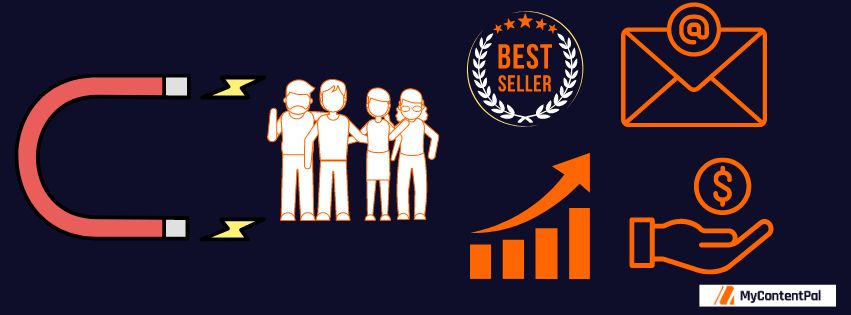
What Are The Benefits Of A Lead Magnet Landing Page?
You already know that lead magnets are used for lead generation and to obtain valuable contact details from potential customers. So why is the landing page so important? A lead magnet landing page is a way to promote your lead magnet.
These pages strategically guide prospects into your marketing funnel. It also nurtures a reciprocal relationship between prospects and businesses. Apart from this, they also offer the following benefits:
- Generate leads: Lead magnet landing pages allow you to connect with prospects on a more personal level. Once your website visitors have an interest in your product or service, landing pages serve as a means to generate more leads.
- Increase conversion rates: Once your potential customers have had a taste of what your company has to offer, they will likely want more. Lead magnet landing pages allow you to gain access to your prospects’ email addresses, whereby you can further nurture leads until they convert into paying customers.
- Grow your email list: Your email list is a treasure trove of potential clients waiting to be turned into loyal paying customers. Lead magnet landing pages prompt website visitors to quickly and easily input their email addresses in exchange for access to your magnet. That email address then becomes part of your growing list of leads.
Shows off brand personality: How you design the layout of your lead magnet landing page should reflect your brand. By keeping a similar theme throughout your landing pages that aligns with your aesthetic, you create continuity, display professionalism and attention to detail, and build trust.
FAQs
Where should lead magnets appear on a website?
Most lead magnets show up on SEO blog posts but can be displayed and dispersed throughout the website. One clever tactic is having your landing page between paragraphs of text. The text would be discussing a particular concern and the landing page would be offering up a solution to that problem.
Pop-up lead forms are often used for their animated and attention-grabbing nature. But if you prefer a less in-your-face approach, sidebar pop-up landing pages are a solid choice.
What should be avoided on lead magnet landing pages?
You know what to include on your landing pages and how to optimise them, but a few (fairly obvious) things should never appear on the page.
- False promises and offers that cannot be redeemed immediately (with the exception of live webinars).
- Deceiving imagery. Any picture of your product must be the exact same thing the customer receives.
- Gaining contact information for spamming purposes.
- Misleading information of any kind. For instance, offering a live webinar when in fact it is pre-recorded.
Do You Need Advice On Your Next Lead Magnet Landing Page?
If designing your own lead magnet landing page seems simple enough, but you want some digital marketing trade secrets to give your page a boost, hit us up! My Content Pal can help you capture leads, attract visitors, and provide valuable insights on creating effective lead magnets. Book a free strategy call with us today. Let’s get your content converting.