When people look for SaaS brands, competitor comparison landing pages are where they’ll eventually end up (if you or your competitor has one). These pages provide an alternative solution for potential customers by highlighting the value proposition of your product against direct competitors.
SaaS comparison pages are a powerful SEO strategy, driving organic traffic and improving visibility. But before you rush to create one for your product, there are a few things you should know. This is why I’ve gone ahead and compiled the best examples of SaaS pages, as well as some dos and don’ts for creating them in the age of AI and SGE.
Here’s a quick snapshot of the comparison pages I’m about to cover:
4 of the Best SaaS Comparison Pages
Let’s take a look at how some big names in SaaS have approached comparison landing pages:
1. Webflow vs Squarespace
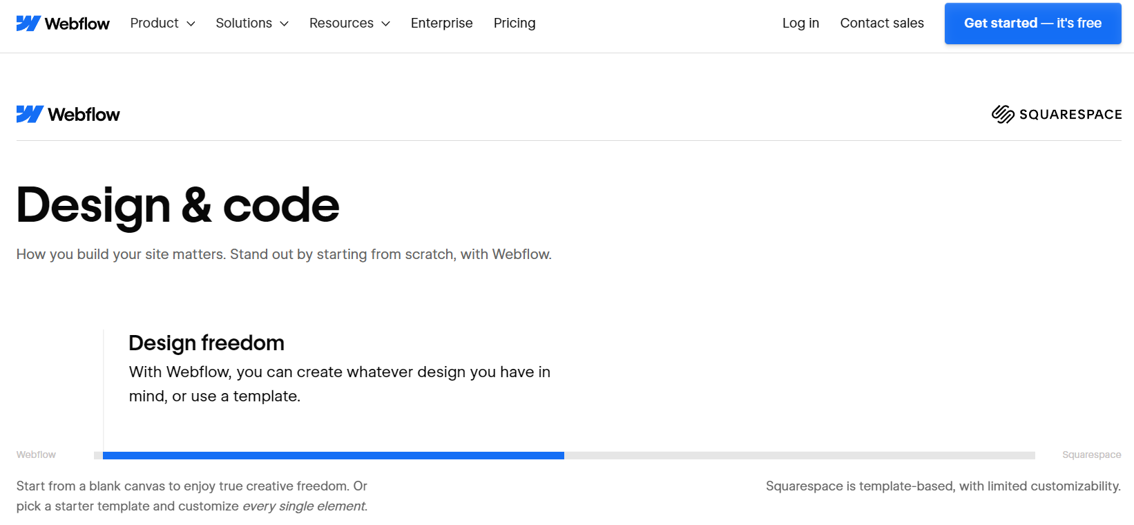
Type: One vs One
Webflow’s comparison page with Squarespace effectively shows the key differentiators between the two platforms. As expected, it paints Webflow as a more powerful and customisable solution, but it does so in a non-offensive or overt way. The inclusion of client testimonials serve the page well as they add credibility and show relatable, real-world benefits.
However, it does fall short in there being quite a bit of text and white space in the actual comparison area. It’s also relatively hard to interpret the comparisons but the animations triggered upon scrolling are a good way to keep the short attention spans of nowadays engaged.
Highlights:
Area(s) for Improvement:
2. MailerLite
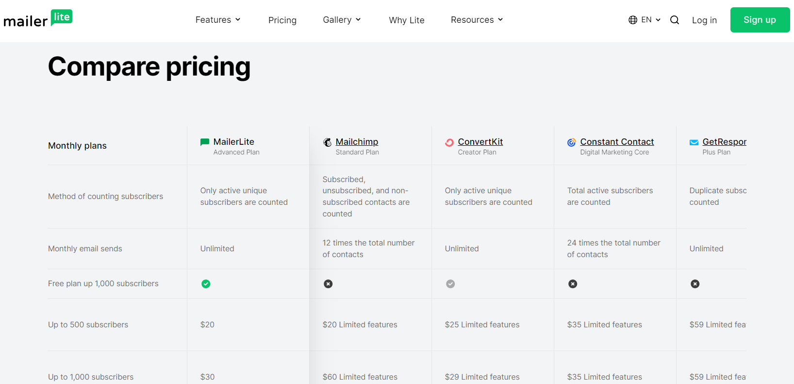
Type: One vs Many
MailerLite’s comparison page is comprehensive and user-friendly. It shows how it stacks up against a series of SaaS competitors. The clear, side-by-side comparison of features, pricing, and user experiences, makes it easy for potential customers to make comparisons.
What I particularly like about this comparison page is the straightforward layout and links to full one vs one comparisons under each product being compared. Another great thing is how it categorises the features being compared using terms that address pain points such as ‘Deliver the right message’ and ‘Create amazing campaigns.’
Highlights:
Area(s) for Improvement:
3. Shopify vs WooCommerce
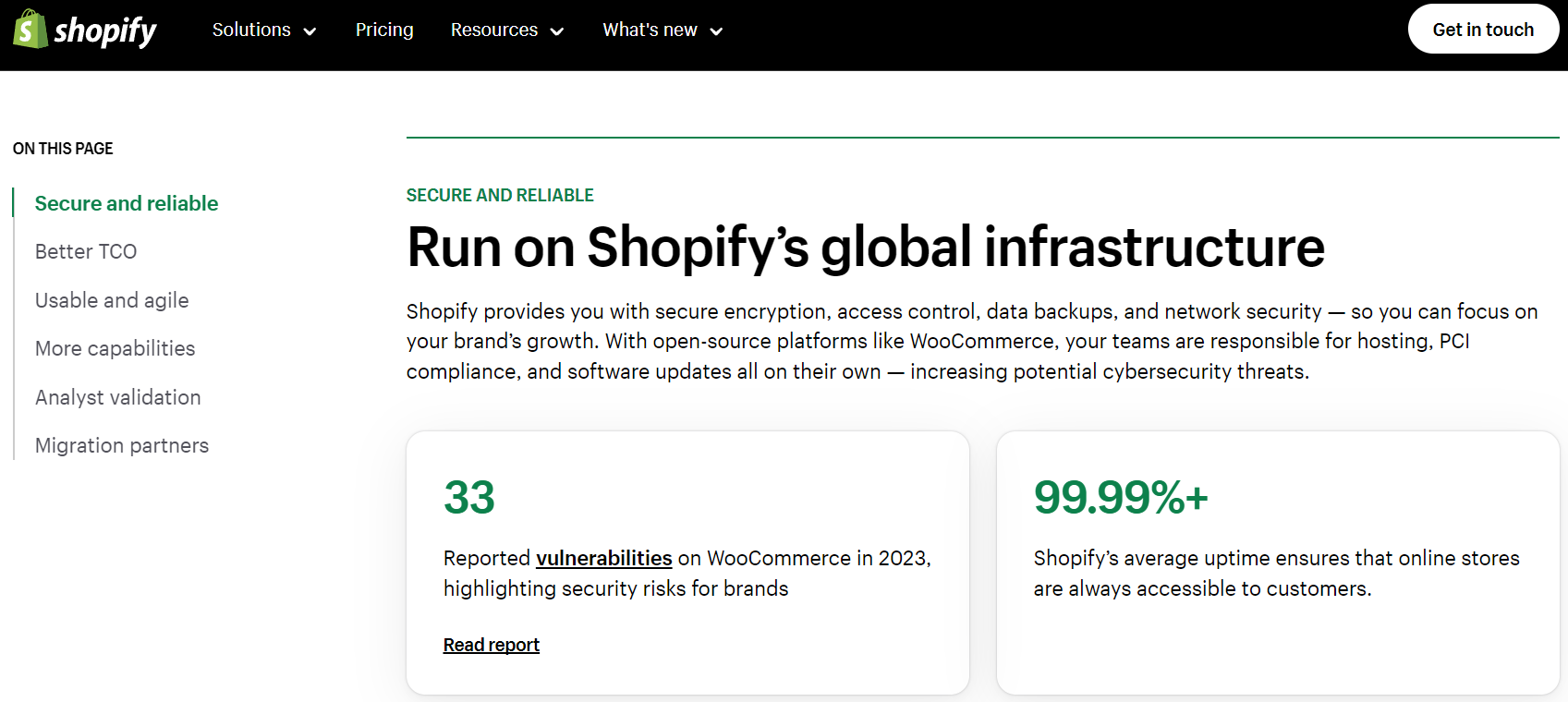
Type: One vs One
The Shopify vs WooCommerce page takes an article-style comparison approach which isn’t bad, especially because of how well the text is broken up. Also, the metric-driven nature of the comparisons serves as social proof while being contextually appropriate given the nature of e-commerce. This is how you should approach your comparison page – structuring it according to the nature of your industry.
Be sure to take a look at the reverse comparison page from WooCommerce to see how they do it.
Highlights:
Area(s) for Improvement:
4. Monday.com
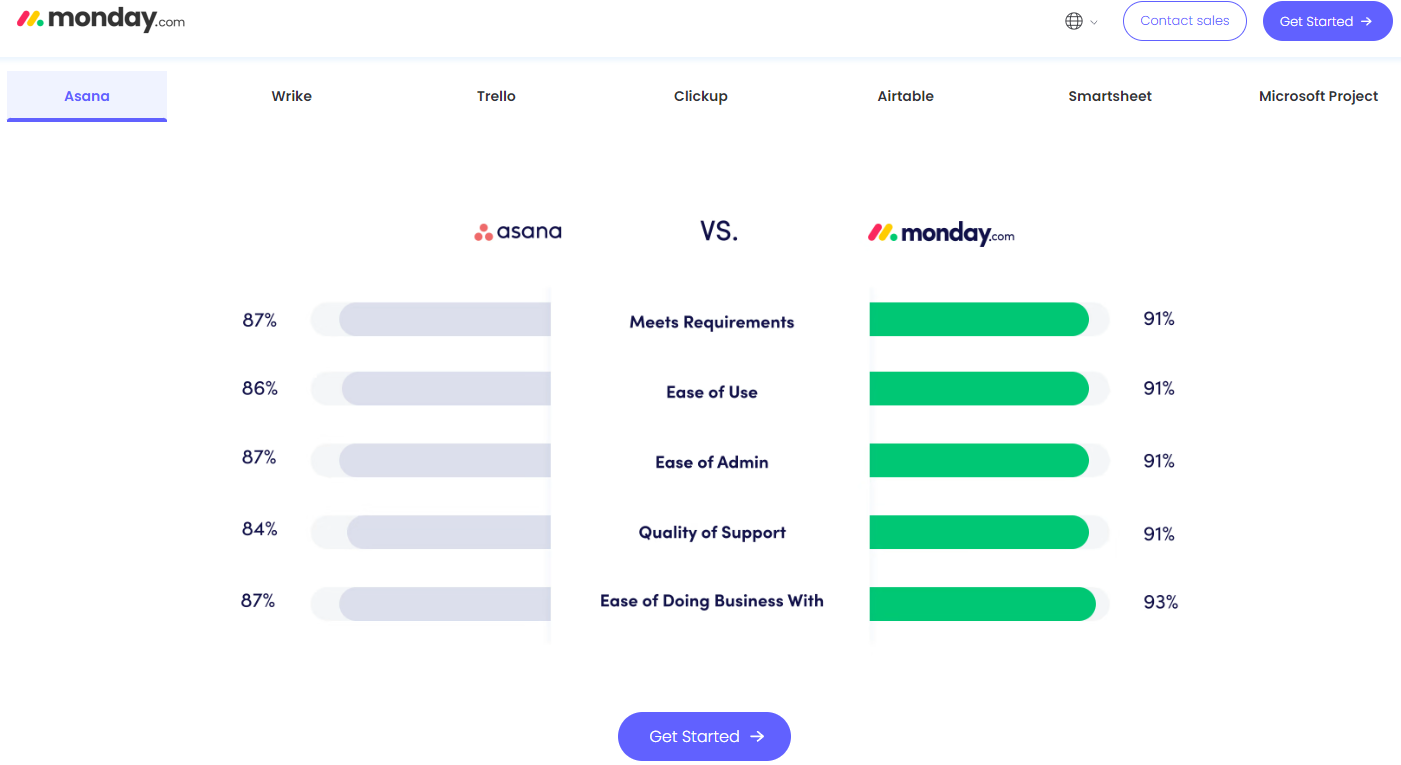
Type: One vs Many
Right away, one of the best things about Monday.com’s comparison page is how it cites that they have over 6,000 reviews on G2 to build credibility. The page features a clean comparison format, meters in addition to percentages. This is effective in terms of it being visually appealing while allowing for quick comparisons.
There are also a good amount of CTA placements and demonstrative animations that aren’t too in your face. Another interesting point is that the CTA buttons are blue which is an easy colour to find on web pages. Plus, blue gives off feelings of sincerity, reliability, and loyalty – a key neuromarketing tip to remember.
Highlights:
Area(s) for Improvement:
Why Create a Competitor Comparison Page for SaaS

Still not wondering why a comparison page is a good idea? Have a look at these benefits:
Increased Conversions
Product comparison pages are designed to address specific needs and concerns of potential customers. They guide users to make an informed decision by clearly outlining the advantages of your product over competitors.
The thing about such a landing page is that it reduces uncertainty and helps build trust. Trust is a huge factor in SaaS because products in this sector typically aren’t cheap. So, if you display transparency and social proof through these pages you can capture high-intent traffic and lead them through a streamlined conversion funnel.
Competitive Analysis
With top of funnel marketing, educating the customer is crucial. Comparison pages help significantly in terms of educating potential customers but also help them understand where competitors might be lacking. While you’re analyzing your competitors to craft this page, you can use the insights gained to drive strategic improvements in your offerings, ensuring you stay ahead of the market.
For example, if you see your competitor is charging extra for a service that you could offer for free, then communicate this in your value proposition.
Dictating the narrative
You can control the narrative with comparison landing pages. Instead of leaving potential customers to form opinions based on third-party reviews or competitor claims, you can present a persuasive argument for why your product is the best.
Do note that it’s important to not overdo it in terms of showing that you’re the best. Back up your claims with social proof or solid facts.
Evergreen Content
Direct comparison content is evergreen, which means it’ll also have value, high search volume (if optimised correctly), and potentially sustained conversions. However, it’s important to regularly update these pages to maintain high search engine rankings and to combat SGE.
Comparison Page Dos and Don’ts

Do
Call to action buttons
Structure competitor comparison pages to include clear and compelling CTA buttons to guide users.
Offer free trials
Increase the likelihood of conversions by providing free trials to let customers experience your product firsthand.
Personalise the experience
Tailor the content on the page based on user behavior and preferences to make the content more engaging and relevant. You could also let them customise their comparison view, so they only see what they’re interested in. Using AI for behavioural analyses could help here.
Clear contact information
Make sure your contact information is easy to find, so users to don’t have to struggle to reach out with questions. I’d also recommend having a chatbot or FAQs section to resolve queries.
Regular updates
Keep your comparison page updated with the latest features, pricing, customer feedback, and relevant keywords. This will help maintain accuracy, credibility, and relevance.
Don’ts
Thin landing pages
Skimmability is important but don’t make a landing page that’s too thin. It needs enough information for customers to make informed decisions. This is where using metric data comes in handy.
Boasting
Don’t boast about your product excessively. Provide objective comparisons and highlight genuine benefits. Use language and phrases that are both emotive yet rooted in fact.
Bad-mouthing competitors
Never bad-mouth competitors, it can just make you look underhanded. Keep a professional tone and focus on your product’s strengths.
Incorrect branding
Maintain consistent and correct branding throughout the page. This means ensuring that you don’t misspell your competitor’s names or mislabel them.
Unorganised content
Organise the content logically and clearly by thinking about how your customer’s pain points. Disorganised content can frustrate visitors and drive them away.
Lack of transparency
Be open about your product’s features, pricing, and limitations. You can lose trust by not being transparent.
Too much focus on features
Don’t overwhelm users with too many features. Instead, highlight how key features address specific pain points and provide value.
How SGE is Impacting Comparison Pages
Search Generative Experience (SGE) is shaking up how search results are presented. Sounds good? Well, it isn’t. SGE is posing a threat to organic traffic by stealing leads from organic search. It generates new content directly in search results, so users won’t have to click through to websites. This means fewer visitors finding traditional comparison pages.
Rest assured, this might not be a huge threat to B2B terms, especially the more technical ones. Why? Because the topic complexity in SaaS can often be too much for AI to condense into an SGE result that people will actually trust.
Also, B2B terms typically require longer answers and demonstrative images, which SGE can’t provide yet. So, people are still more likely inclined to go for human content in this case.
But, if you find yourself having to combat SGE, you should analyze SGE results to identify gaps and enhance your comparison content accordingly. One easy way to do this is by updating your page with the most current content/updates to keep it relevant. Customer testimonials and interactive comparison tables can also be incredibly helpful in this regard.
I’d also recommend checking out the post below on how to increase the potency of such pages.
https://www.linkedin.com/feed/update/urn:li:activity:7112451584336293892
FAQs
How can SaaS companies use competitor comparison pages to improve SEO efforts?
Target high-intent keywords like ‘Competitor A vs Your Product’ and ‘Best alternatives to [Competitor B].’ Then, consider creating multiple comparison pages for different competitors to capture a wider audience. Also, using structured data markup, optimising meta tags, and including internal links to these pages can enhance search engine visibility.
What role do visual elements play in the effectiveness of SaaS comparison pages?
Visuals like comparison tables, charts, and screenshots can improve readability and page engagement. They help users quickly grasp key benefits and differences. Interactive elements, like cost calculators and feature toggles, further increase engagement by allowing more personalised comparisons.
How can smaller SaaS companies compete with industry giants using comparison pages?
They can do so by focusing on niche markets and highlighting specific features that cater to these audiences. Personalizing comparisons to address the unique needs of niche segments is also a good approach to differentiating your product. Another viable strategy is using the testimonials of customers who have made the switch from larger competitors.
How can SaaS companies effectively highlight their unique selling points without appearing biased?
Use data-driven comparisons, like third-party stats and customer testimonials. These help present an objective view. It’s also wise to highlight unique features that solve specific pain points, even providing real-world case studies if possible.
Final Thoughts
Like I said, potential customers are forever likely to land up on a comparison page. So, rather it be yours than your main competitors. Effective SaaS comparison pages are crucial for showing your product’s value and winning over customers. Just make sure your page highlights key features, provides customer testimonials, and addresses specific pain points.
Trust me, if you structure your page just right you’ll see your SEO improve, attract more traffic, and ultimately stand out in a crowded market.
And if you’re still stuck on how to go about making an effective comparison page then ask yourself these sorts of questions:
- What unique strengths can your SaaS product emphasize to stand out on a comparison page?
- How can you incorporate social proof effectively without overwhelming the reader?
- What strategies can you employ to ensure your comparison pages rank high on search engines?